Review: Noteshelf 2

Disclaimer! I received this app for free by Noteshelf (Thank you!)
Note, that I am not paid for the review, and I am free to write whatever I want, or even decide not to review the app at all. My reviews target neutral conclusions based on my usage, to let you draw your own judgments if this app is right for you.
One of many usages of the iPad for productivity is the use of the Apple Pencil to take handwritten notes. Whether in meetings, lectures, or for simple brainstorming, having handwritten notes in a digital way is a handy way to archive notes and have them on the go with you all the time.
Noteshelf is yet another competitor in the area of note-taking apps for the iPad. Utilizing the Apple Pencil, this app promises to be a good replacement for your traditional notebook.
I take a look at this app and analyze how it can compete to other applications, how it is implemented and if it is worth your money.
Summary of Noteshelf 2
Great Ink Engine with many different brush types. Auto-publishing to Evernote.
No OCR for handwritten text. Few customizability in options.
$9.99
Developer iOS/iPadOS App Store macOS App Store Google Play Store
Tested platforms: iPadOS macOS iOS
This review tested the following versions: iPadOS: 2.1.
Overview
Noteshelf is one of the older notebook apps for the iPad, dating back as far as 2014. Long before the iPad Pro and the Apple Pencil, Noteshelf 1 already provided a note-taking experience using a passive stylus, third party solutions, or simply writing with the finger.
While Noteshelf 1 still seems to receive some maintenance updates, it has been replaced with Noteshelf 2 in October 2017. Noteshelf 2 is re-invented with major improvements for the Apple Pencil and the larger iPad Pros, comes with an iPhone compatible app for reading notes on the go, and many other new features.
As both applications cost the same, Noteshelf 2 is the way to go for new users. If you already possess the previous version, you might look into doing an upgrade, as the list of changes is rather long. Keep in mind, that new features and future updates will likely only be available for Noteshelf 2, too.
This review will go through the app from the perspective of somebody who has never used Noteshelf (1 or 2) before.
Pricing
Noteshelf comes with a flat pricing. The app costs $9.99 and is a universal app. Thus, it can be used on both the iPad and iPhone. There is also a companion app for Mac, and one for Android, but I have not tested them yet.
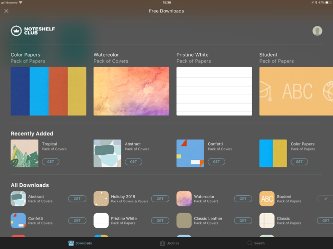
The app comes with all functionality. There are no in-app purchases or similar. There is no account needed to use the core functionality. However, extra page backgrounds and notebook covers can be downloaded if creating an account using your e-mail address or social media logins. This registration is free and does not involve a subscription fee or alike. If deciding to register, there is a long list of extra stuff available for free download.
Traditional notebooks
Noteshelf, as the name probably already suggested, tries to be about notebooks. Its core unit is a notebook. Everything is a notebook, even imported PDF files or documents from other applications, more on that later.
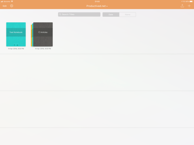
When starting, Noteshelf greets one with a small introductory tutorial. Then, it leads you directly to your note shelf. A note shelf is a grid of all available notebooks. The application comes with a tidy clean UI.
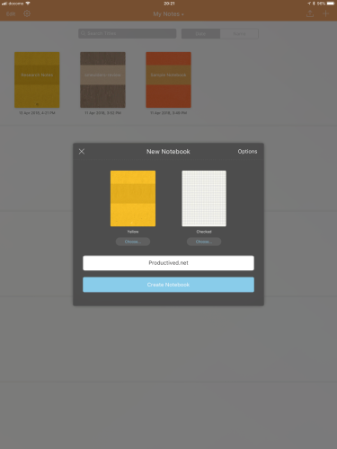
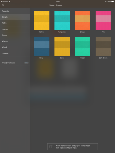
New notebooks can be created with few clicks - either by customizing page backgrounds and a cover image for a new notebook, or by simply using the Quick notebook function creating a plain notebook with a random cover.
Organization
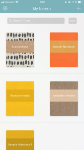
Different notebooks can be organized into categories and groups. A category is basically a second note shelf. On the top there is a button called My Notes. This is actually a category called My Notes. Other categories can be created and just switched by clicking on this title.
Inside each category, there is a similarly looking grid of all notebooks available. A group is a folder, or stack of notebooks, which lies inside a category.
Using categories and groups, notebooks can be organized into two layers of abstractness (E.g. Project and Sub-project.)
Notebooks and page layouts
When clicking on a notebook, it will open and show its first page. The cover is only used as an icon for the notebook. The pages are based on templates with all kinds of available patterns in different sizes.
Pages in Noteshelf are individual. There are set page boundaries. No unlimited scrolling or alike is available. Pages scroll horizontally, and new pages are created by simply continue swiping after the last existing page.
The size of each page can be either a standard size like A4 or US Letter, or just be set to be conveniently sized for mobile (iPhone) or iPad Pro 12.9”. Preinstalled, Noteshelf comes with all the common layouts like ruled pages, checked pages, dotted pages, or squared pages.
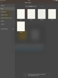
Logging into the previously described optional Noteshelf account, a large number of additional page layouts can be downloaded for free. This includes productivity layouts like daily/monthly planners, task lists or meeting notes, or layouts for students like graph papers and Cornell notes. There are also various options for colored or textured backgrounds.
If everything fails, custom backgrounds can be added. These would be simply images imported into the app from any other app or cloud storage. Thus, one can create new page layouts using an image editor or sketching app.
Existing notebooks can also be used as a template for new notebooks. For example, it would be create a multi-page template for something like yearly planners or project management, and then use it as a template at the beginning of every year or when starting a new project.
Ink Engine
The most important thing for an entire app dedicated to creating handwritten notebooks would be, of course, the handwritten part. In the following, I will look over how this is implemented and which features it provides.
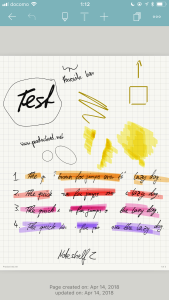
Overall, the Ink Engine is very smooth and satisfying. With the Apple Pencil, there is no noticeably delay and the strokes create a rather beautiful handwriting. Next to the Apple Pencil, the application also has built-in support for Adonis, Wacom, and 53 Pencil pens. These have not been tested in this review, as the focus lies on the Apple Pencil. Writing with the finger is obviously also an option, but rather clunky.
An example of a written and exported document, using different settings and brush styles, can be downloaded over here.
Pens
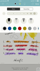
As usual, there are generally two options for pens: First, normal pens, and second, makers. The difference would be, that the latter uses transparency, while the former does not.
Each option can furthermore be individualized with stroke thickness and color. There are many options for either. From very thin to very thick, everything is available.
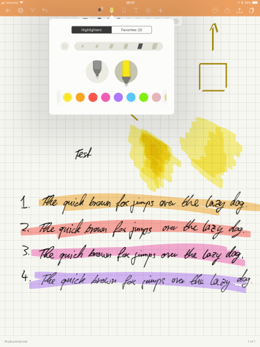
eThere are 14 preset color settings, but a simple swipe opens a new menu where any colors in the RGB range can be added as new custom colors. Furthermore, there is an import menu for downloading presets of aesthetically pleasing color palettes, which is pretty neat.
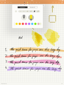
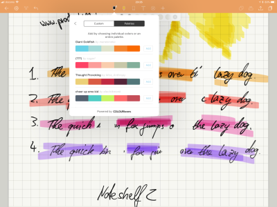
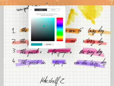
The marker is implemented in way where multiple strokes create a slightly darker transparency, as they will not merge, but overlay on each other.
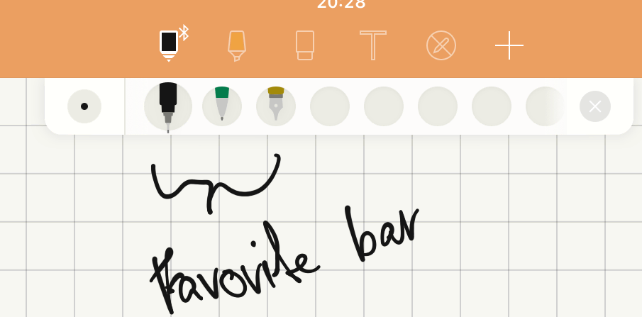
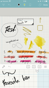
A combination of brush type, stroke thickness and color can be starred for quick access in the favorite bar.
Brush styles
For pen input, Noteshelf comes with a variety of options not available in its direct competitors. There are four different brush types. One could also say, fonts for handwriting. Using these, the handwriting will behave substantially different in its look and feel. Mainly, the brush will decide on how tilting and pressure sensitivity work.
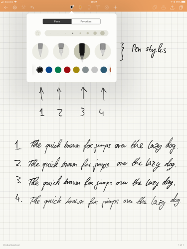
The first and third option in the menu are two kinds of pens. They look very similar, but have a slightly different feel.
The second option imitates a fountain pen. It looks rather individual and gives the handwritten text an individual style.
Lastly, there is a forth option for a pencil, which has a very particular look. It tries to imitate the look of a graphite pencil, almost becoming somewhat textured.
The pressure sensitivity can be toggled in the settings, and is only available with an Apple Pencil.
Toolbox
Eraser tool There is an eraser tool, which works as expected. It erases strokes, and can be set to different sizes, as well as an automatic size which scales with the zoom factor (I think?)
The eraser is implemented in a way, where it erases partial strokes (like a real eraser would do.) There is no option to make it erase full strokes.
Lasso tool There is a scissor button in the top menubar, which provides a lasso selection functionality. After clicking it, something can be selected by simply drawing a circle around it.
Then, the selected part can be moved, resized, or recolored. This is very handy during lectures or meetings, where figures and drawings can be moved around or resized at any point, a great advantage over analog notes on paper ;). A selected section can also be copied or pasted.
Shape tool Another interesting button is the shape tool. It basically straightens all strokes drawn while it is active. From circles over triangles to squares, the application tries to guess what you try to write and then proceeds to straighten all those strokes to its closest shape.
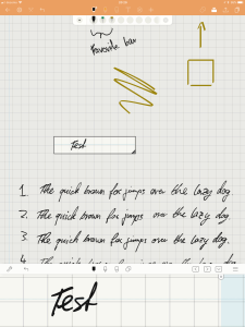
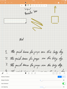
Zoom box Lastly, the application offers a zoom box. Activating this function opens a new UI element in the bottom. It will show a larger zoomed area of a small movable box on the screen.
One would write inside this zoom box on the bottom of the screen, and the handwritten text appears inside the square box. This zoom might help with writing small text or keeping a straight line will writing. If hitting the end of the zoom box, it will move forward a bit.
This functionality is mainly a relic from earlier versions, especially before the Apple Pencil was a thing. Then, using finger input, a zoom box was almost a necessity for a handwritten note taking app to make sense.
Nowadays, it really depends on user preference. I, for example, would rather just zoom in using a pinch gesture, and then write on the page normally. Therefore, I don’t have a good use for this function. Well, one way or another, this feature is available, for anybody who is interested in it.
Other features
There are a couple of other notebook related features, which I go over in the coming section. These are not related to handwriting, but are rather extra features.
Audio recordings
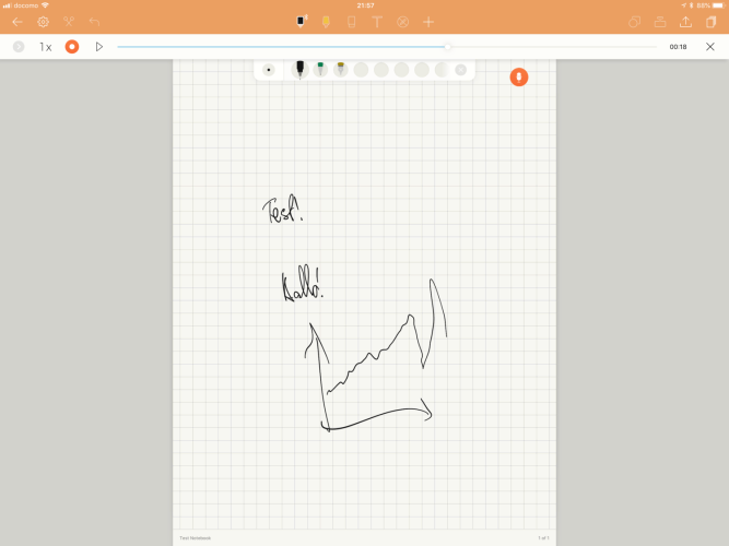
It is possible to take recordings of audio, while writing notes. It will simply use the built-in microphone of the iPad to record any surrounding voices. Afterwards, this audio can be played back and listened to, using a built-in audio player.
There is no support for a live-video which integrates the handwritten notes and audio recording, where one can see his own note taking as a video playback. If interested in something like that, you need to look elsewhere (e.g. Notability.)
Text boxes
The application also supports text input using a keyboard. Longer texts can be entered into text boxes using the on-screen keyboard or any attached external keyboard.
It supports bullet points and check boxes, which could be used to create task lists or meeting notes combining both printed and handwritten sections.
Page organization
To find important notes in a large archive of maybe hundreds of pages per notebook, it is possible to create bookmarks and tags for pages. The former is similar to bookmarks in PDF apps. The latter allows you to give keywords to a page, which can then be filtered in the side menu.
There is also a search button, which can search for printed text in imported documents or when written with a keyboard. Unfortunately, as Noteshelf 2 has no OCR capabilities, it will not find any results of handwritten nature.
Importing images or documents
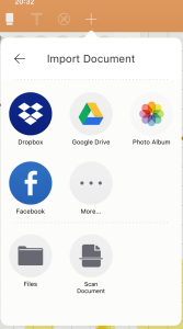
One can import images or documents into notebooks. Documents, in form of e.g. PDFs, are attached to the notebook as new pages. Other things, like images, simply become an object on the current page, which can then be resized and moved to the proper location. This could be used to take notes on top of graphs and images from other sources. The camera can also be used to take a picture to be included to the current page, so one could use it to take a picture of a blackboard or whiteboard and include it into the current notebook page.
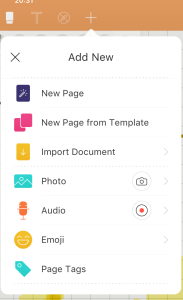
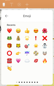
There is also a button to add emoji to the page (Another great advantage over analog notebooks?!)
File management
In this section, I will look over how Noteshelf works in terms of file management: import, export, syncing; generally how it interacts with other documents and applications.
Importing
As outlined just before, documents and images can be directly attached and inserted into notebooks. Furthermore, full PDFs can be imported from other applications, cloud storages or the Files.app in iOS 11.
The imported document (e.g. PDF) is then represented as a new notebook, where each page is a page from the imported document. As it becomes a normal notebook, new pages can be added, too. Handwriting works as if it would be a notebook, which allows for annotating PDFs.
There is also an option to scan analog documents. The camera will pop up and you are ought to take a picture of the page or book. The camera menu will then try to find the document inside the picture frame for you, cutting the edges correctly.
This feature is similar to scanning apps like Scanbot, but rather limited. It does not support modifying the imported pictures using color filters or making the scan greyscale.
A scanned document becomes a new notebook, just like other imported documents, but have a slight margin around them (as if they are images imported to a notebook).
For more pleasing scans, it would make sense to use a dedicated app, and then import the PDFs to Noteshelf afterwards.
Exporting
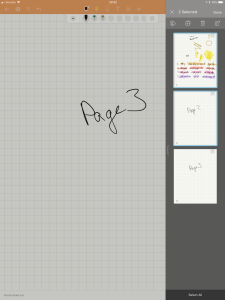
One can either export full notebooks or selected pages.
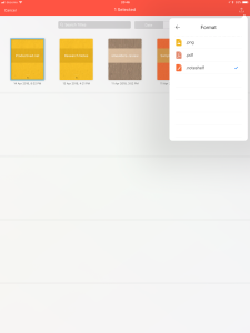
Full notebooks can be in a proprietary .noteshelf format, which presumably keeps some Noteshelf-only features alive. Of course, these files will not open in any other app, so the usage is rather limited.
Luckily, one can also export files as PNG or PDF, compatible with any other applications. When doing so, one can either select single pages, or just export an entire notebook.
The export process is rather straight forward. The page background can be either included or omitted. The destination could be e-mail, but also various cloud storages or anything compatible with the Files.app.
Syncing
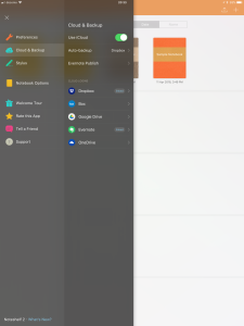
For sync and backup, Noteshelf has quite some options. First of all, an auto-sync is available through iCloud. It will sync with other devices, or can simply be used for backup purposes.
There is a second option for automatic backups. In the options, Noteshelf can be set up to backup Notebooks to either Dropbox or OneDrive. The files are regularly pushed to the chosen cloud storage service in its proprietary .noteshelf format.
Then there is something else: Auto-publishing to Evernote. Using this, the notebooks will become a note in your Evernote. Each notebook becomes its own note - and each page within the notebook will be embedded into the Evernote note as consecutive JPEGs. If the Noteshelf notebook is edited, the Evernote note will update shortly after.
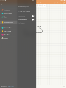
Auto-publishing and auto-backup can be toggled individually for each notebook.
iPhone app
As Noteshelf is a universal app, it can be installed on a iPhone.
Obviously, the screen estate of even a iPhone Plus will not be big enough to do any productive work with handwritten notes; even ignoring that the currnet iPhones are not compatible with the Apple Pencil. However, it might be convenient on-the-go, if you quickly need to look up a thought from earlier.
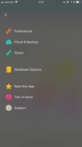
The iPhone is mostly identical to the iPad version, just adjusted to the smaller screen.
Apple Watch support
The app can also be uploaded to an Apple Watch. There, it can use the built-in microphone of the Watch to record audio. Audio recordings are sent to the iPhone/iPad app, where recordings can be attached to notebooks.
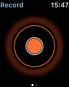
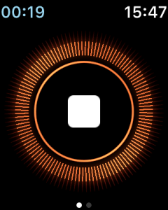
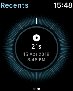
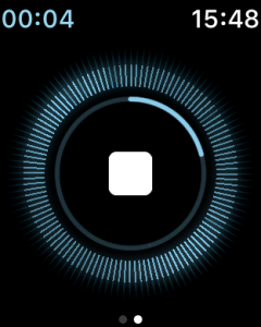
The Watch app currently has no other features.
Future wishes
Lastly, some thoughts on things which I am currently missing in Noteshelf, and hope for support in future updates.
OCR support is very high on the list of things which I would love to see, and my only major gripe of this app. Being able to search handwritten notes is an incredibly difficult thing to implement, but also incredibly valuable. Currently, only GoodNotes and OneNote have this. I would love to see similar features in Noteshelf 2.
There are a couple of, admittedly pretty nit-picky, customizability options which I would also love to see:
First, it would be a nice addition to be able to move UI elements. Especially for left-handed users, which often share the habit of writing from above the pen tip location, the top UI bar often gets some ghost touches while writing.
Second, the markers are implemented in a way, where multiple strokes overlay each other and get darker as transparency stacks. It would be nice to have a merging option which avoids this.
Third, the eraser currently uses partial erasing, where it erases all touched parts rather than a full stroke. While this behavior is certainly my preferred way, more options never hurt, so it would be nice to have an option to remove full strokes.
Forth, page boundaries are currently set in stone, and switching pages is a long horizontal swipe. It would be nice to have options for vertical scrolling. It would also be nice to have continous scrolling between pages. For example, in landscape mode, there are large borders around the page, which could be naturally avoided be simply showing part of the neighboring pages.
Conclusion
Noteshelf is a great competitor in the field of note taking applications.
With its well-implemented Ink Engine and four different brush styles for the handwritten input, it can be closely customized to the individual preferences of the user. This makes it one of the most complex Ink Engines of the note taking applications tested so far.
The application comes with auto-backup to Dropbox or OneDrive. Even more exciting is the auto-publishing to Evernote. Using this feature, notebooks are kept in sync with Evernote notes, which is a convenient feature not available in any other tested app so far. As Evernote is my main archive for all kinds of documents, I love this.
All-in-all, checking out Noteshelf 2 would be highly recommended, especially if unsatisfied with the inking or general look of handwritings in other apps. It is a great app, and except some nitpicky requests outlined earlier, I can not come up with many drawbacks.
Pro
- A great Ink Engine with many different brush styles and customizability.
- Supports auto-sync to cloud storage and auto-publish to Evernote.
- Hits a sweet spot in clean UI with many features and easy to use.
Contra
- No OCR functionality for handwritten text.
- More advanced customizability options would be nice.
Summary of Noteshelf 2
Great Ink Engine with many different brush types. Auto-publishing to Evernote.
No OCR for handwritten text. Few customizability in options.
$9.99
Developer iOS/iPadOS App Store macOS App Store Google Play Store
Tested platforms: iPadOS macOS iOS
This review tested the following versions: iPadOS: 2.1.

Screenshots


Disclosure: This post may contain affiliate links. This means I may make a small commission if you make a purchase.
About me
Dr. Marc A. Kastner
I am an assistant professor working on computer vision and multimodal understanding. I am interested in task- and knowledge management. In my free time, I blog on productivity workflows and apps.
For my professional portfolio, please visit: marc-kastner.com
See Also
Flexcil
Flexcil is an underdog in the group of annotation apps for the iPad. While rather new, it comes with some novel approach and fresh wind. …
Read More...GoodNotes 4
When digitally taking handwritten notes, it is easy to lose track of notebooks and documents. Stuff can simply get lost in large digital …
Read More...Notability
When going digitally with your paperless workflows and the Apple Pencil, the need for a great note-taking tool comes pretty soon. The …
Read More...