Review: MyLifeOrganized

MyLifeOrganized (short, MLO) is a beast. The main pillar of MLO is customization. It is a suite which comes with a preset interface, but almost everything in it can be fully customized to the users needs.
MLO can work with Getting Things Done workflows. MLO can also do many other workflows. It is a large productivity task managing suite, which can adapt to virtually any workflow. During the initial setup, there are presets for multiple different methodologies. The very open customization capabilities make it a good app for virtually anything.
But, does it hold it’s promise? What features are customizable and how does it adapt to everybodys needs? We will take a look at this nice piece of software on all its supported platforms.
Summary of MyLifeOrganized
Highly complex suite for all task management needs. Can adapt to any workflow.
Expensive. Freedom of customizability can be intimidating.
Windows $29 (Standard) to $59 (Pro), Mobile Free (Standard) to $25-30 (Pro), optional subscription for Cloud sync
Tested platforms: Windows iOS Android
This review tested the following versions: Windows: 4.4.8, iOS: 3.2.9, Android: 2.11.3.

Recent updates (March 2018): The public beta for MLO 5 for Windows is ongoing. This review looks at MLO 4 for Windows, and will be updated for the final release of MLO 5.
The new Windows version comes with an updated Windows UI and a couple of new features. The iOS and Android have no bigger update due. If you purchase today, the update to MLO 5 for Windows will be available for free.
What kind of app is MyLifeOrganized?
Their slogan is “MyLifeOrganized – The Most Flexible Task Management Tool.” Thus, the app focuses on flexibility. That includes customizability and freedom. It does not force a specific workflow but allows the user to customize and adjust the app to virtually any workflow. I’d go as far as calling it a framework, which focuses on providing very in-depth customization capabilities for all productivity needs.
MLO is available for Windows, iOS, and Android. A Mac version seems to be in the planning stage for a couple of years. A very popular app for Mac is OmniFocus, but many people dislike it being Apple-centric, as there are no clients for non-Apple platforms. MLO solves this. While it has no app for the Mac, it is a big competitor with apps for all other big platforms, including Windows and Android. This is perfect for somebody who uses Apple privately, but a Windows PC at work, for example. If MLO gets a Mac release, it might even be a serious competitor to OmniFocus.
In daily usage, the Windows app is aimed to be the main app. It is the central pillar in this suite for organizing and structuring data. That being said, a majority of the functionality is also available in the mobile apps. They might even work autonomously. Focusing the sole setup on only mobile devices might take ages, though, and the symbiosis of all of MLO’s customization really comes in play when using it on the Desktop. The mobile apps can work as a great companion, as they can display all task data in the same custom ways as the desktop app. All apps support various syncing methods.
Syncing
Task management apps stand and fall with their ability to sync data. In today’s world, everybody uses multiple computers, a cell phone, a tablet, and maybe more. The task data needs to be in sync on all devices, just to be able to always access the data when necessary.
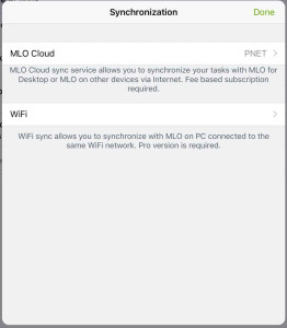
MLO supports a variety of systems to sync the data. While all methods sync the same data, their purpose differs quite a bit:
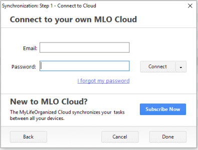
Cloud sync The cloud sync is implemented as a subscription service. After registering a new account on the MLO website, the Cloud sync service allows syncing between unlimited devices, including the Windows, iOS and Android apps. On both Android and iOS, the Cloud sync supports push; so tasks are updated instantaneous, even in the background.
Unfortunately, the sync service is just syncing. There is no web access to the data in form of a web interface. Data can only be accessed from within one of the native MLO apps on Desktop or Mobile.
The Cloud sync comes with some extra functionality: Access to a special email address called @sync.mylifeorganized.net. Using this address, one can [send emails directly to the MLO inbox. The content of an email is added to the MLO inbox as a new task – the email title is the task, with the email body as a note. They are added to the cloud in the background and pushed to all connected devices on next sync.
MLO does not support other third-party cloud services: Neither Dropbox, iCloud nor others are available as an option. The main database of MLO is a single file, so it would be possible to just drop it into the Dropbox and use it from within. Then, it could sync to other Windows computers via Dropbox. There are no other options for mobile, though.
The Cloud sync allows rudimentary collaboration features. Cloud-synced databases can be shared between multiple users, allowing to work on the same project. As Productived.net foremost concentrates on personal productivity, this has not been tested in-depth. It also seems to play a secondary role in MLOs marketing, so the main focus lies somewhere else.
One thing to mention, the Cloud sync does not support end-to-end encryption. While the developer promises the files being stored on the server with privacy in mind, the user needs to trust MLO Sync servers with all its data.
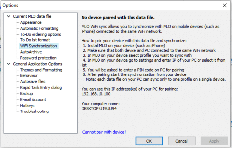
Wi-Fi sync The Wi-Fi sync is the free option for syncing. As in, it does not need a subscription, unlike the Cloud sync functionality. Using this, data can be synced to one other device on the same Wi-Fi network. Yes, one other device. This feature, unfortunately, is limited to a one-to-one sync between a Windows client and a mobile client. Also, it needs the Pro upgrade on both clients.
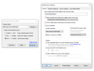
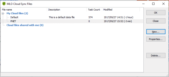
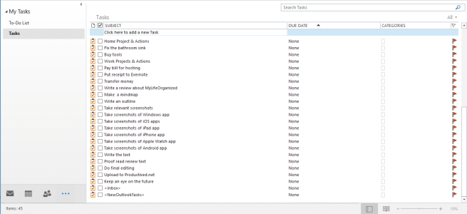
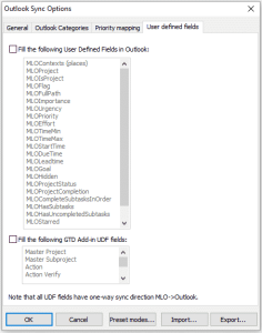
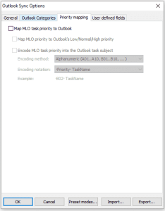
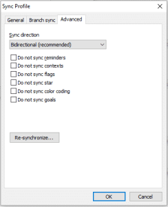
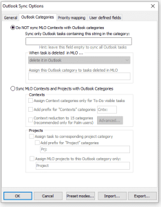
Outlook sync For people regularly working with Microsoft Outlook, more specifically the todo functionality of Outlook, this feature could be interesting. It is a two-way sync between the local Outlook database and MLO. There are a vast number of options, which allow customizing of how data in either app is mapped to the functionality of the other.
Other options For enterprise use, the data can also be uploaded to an FTP server. The whole database lies in a single file, which is updated on every save, and kept in sync. Other than the Cloud sync, which syncs all data to an unknown server (managed by MLO), this feature allows the use of a private server. However, this feature does not allow email inbox support, which only works in combination with the Cloud sync.
These are a lot of options for sync. The most convenient one would be Cloud sync, despite its price. All other ones can be added for special use-cases, as needed. It is generally possible to use multiple sync methods at the same time, so they also can be combined for different devices, and so on.
Pricing
As MLO is a pretty advanced and complex app, this comes with a comparatively high price. Except for the Cloud sync service, which is an extra subscription, all prices are one-time payments for the current major release. A future major update might have an upgrade cost attached.
On all platforms, MLO comes in two flavors: Standard and Pro. Standard contains the Core functionality for most task managed workflows. Task outlines, reminders, scheduling, contexts, filtering and searching.
On top of that, there are a couple of very advanced tools, these are the heart of MLO’s customization. This is where MLO flourishes compared to its competitors: Custom views, the calendar view, recurring tasks, task dependencies, location tasks and GTD Reviews. All these are part of the Pro upgrades. These are features which are incredibly useful for more complex GTD workflows and highly recommended.
Windows The Desktop client is a major pillar of the MLO based productivity suite. The pricing is $29.95 (Standard) or $59.95 (Pro).
Mobile For the mobile platforms, the Standard version is free. On the Android platform, the Pro upgrade costs $24.95, and on the iOS platform, the upgrade costs $29.99. As it is a universal app, the iOS upgrade is shared between multiple devices, including iPhone, iPad, and Watch.
Cloud sync The Cloud sync costs between $2.95 for a single month, up to $25.95 for a two-year subscription. It can be used with either Standard or Pro. The Cloud sync service is optional. Without it, MLO can still do its work locally or with Wi-Fi sync (the latter only available in Pro, though.)
Support
MyLifeOrganized is not only the name of the app, but also of their Ukrainian company – that is, the developer of the app MLO. The website is available in English, Russian and Chinese. The Russian website has its own customer support forum, while the English one relies on Google Groups. Nonetheless, it is active and there are regular posts by both customers and the support team of MLO.
The team can also be reached for extra support and questions via e-mail. They usually seem to reply within a few working days.
As MLO is somewhat an underdog in its field, there are fewer guides and reviews to be found in the internet, compared to more popular competitors. However, as app updates and forum responses have been very active over the last two years, it seems well supported by the developer and there is no worry that it will be a viable option for the foreseeable future.
An in-depth look on the Desktop
This section will go over all functionality, MLO has to offer. For screenshots and showcases, it will use the Windows version. The Desktop version seems to be the largest beast of the MLO family, both in terms of available features and customization.
When first launching MLO, it will look like this. It is a simple empty example database waiting to fill with tasks and projects. After some real usage, there can be hundreds or even thousands of tasks over hundreds of projects, without any issue.
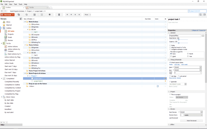
MLO is one of the few apps which can deal with thousands of tasks without losing its breath. Over the course of reviewing this app, it has been in use for about a year, in a database with about a thousand active tasks in total. To keep private data private, the following will use example data to outline functionality.
Task outlining
The heart of a task management app is, well tasks. And projects. MLO has two main ways to display its data: Hierarchies and lists. In the background, everything is based on a hierarchy, but the view on the data will change. More on custom views later.
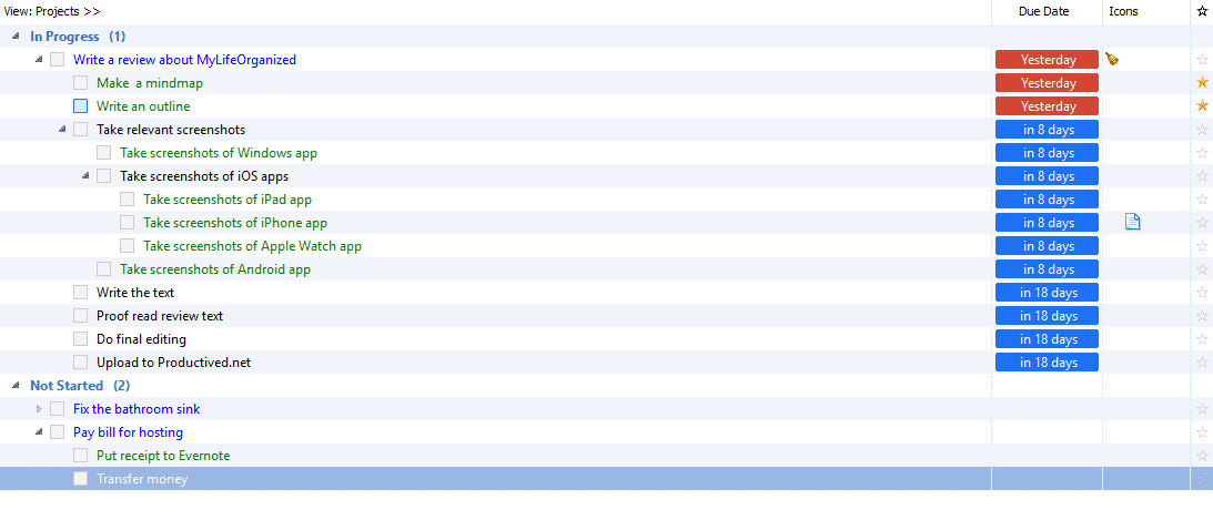
When working with a hierarchy, MLO officially calls it a task outline. It will display trees based on the available tasks, just like an outline of a document. Tasks in projects are indented. Everything can be filed into folders for another level of abstraction. Any folder can have sub-folders, projects can have sub-projects, any task can have sub-tasks. There is really no limit for depth and complexity. Therefore, the indentation is nearly unlimited. In this setup, the folders are printed bold, available tasks green, and projects blue.
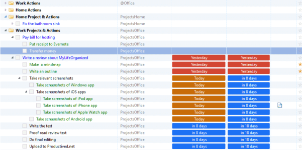
When switching to a list, the same data is presented in flat. This would be close to a next action list concept in GTD or other apps. You won’t see folders or projects, but the focus lies on single available tasks. What is shown; that is defined by the current view and fully customizable. In this example, it is the standard next action list.
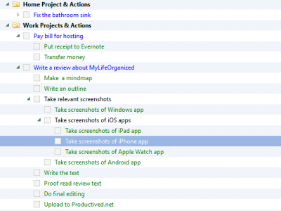

This is an integral part of the application. There a numerous views on the data: All of them will show the same data, but allow for filtering for different things, sorting them in a different way. Any view can show a different set of meta-data, in a different way. In the background, all views use the same database. If you are a programmer: MLO is like a large relational database for task management, and the GUI is a framework for creating custom views on the data.
The layout has the form of a table. It is completely customizable: One can add new columns, hide other columns, everything can be customized as wanted. Every view saves the columns separately, so one would be able to create multiple views showing different kind of meta-data.

Entering a task
One of the pillars of GTD, at least, is capturing. All ideas and thoughts should be captured into a trusted system. MLO could be such a trusted system.
There is a central folder called Inbox. It is the entrance door for new tasks. By GTD methodology, every thought should pass the Inbox. Like an email, which enters the Inbox, before it is filed into a subfolder or archived.
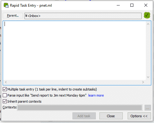
There is a menu for rapid input. It allows for quick entry of tasks to the Inbox. It can be triggered with a system shortcut – even if MLO is in the background. No matter what app the user has his focus on, a shortcut will open this small rapid input menu, ready to capture tasks.
There is even an advanced syntax. It will detect due dates, contexts and other things automatically. For example, Send report in 3 days remind tomorrow 10:00 @ ProjectX.
Despite this, any view allows for entering tasks just by typing. When being in a task outline, just hitting Enter will add a new task in the next row. This allows a quick entry to projects, folders, or sub-tasks.
The GUI supports drag and drop for ordering tasks. This would be mostly used for organizing the outline view. Lists on the other hand are often set to be sorted automatically. Sorted by due dates, or urgency, importance, etc. MLO can figure out which tasks would be the most urgent ones and sort a next action list accordingly.
Task meta-data
So, how about the capabilities of task editing; which data can be added to each task or project. There are quite a few options, actually. After the normal ones, a title, note, and some dates, it gets much more complex.
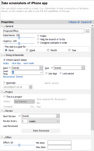
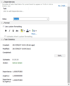
In the following, I will quickly skim over the available meta-data for tasks:
Start and due dates If the start date is set, the task gets scheduled to start at a later date or not. Until then, it will be omitted from next action lists etc. depending on the settings. A due date is basically a deadline. Soon-due tasks are color-coded so deadlines won’t be missed. These dates also play a role in sorting the next action list, as the algorithm will use these dates for better sorting.
Subtask order The setting Complete subtasks in order seems innocent but is mighty. It toggles between sequential and parallel projects. If checked, tasks within projects, or subtasks, are only doable in order. In the tree view, everything still displayed as before (now, in black instead of green). In the next actions list, however, it will actually only show available tasks – one by one in case of a sequential project.
In GTD methodology, there is a focus on removing things from mind: e.g. flagging undoable tasks with a deferred date. In the same fashion, a subtasks in order feature allows hiding future tasks from the main next action lists. This allows a greater focus on actually doable tasks.
Importance and Urgency The sliders for importance and urgency allow some interesting behavior. In next action lists, MLO will try to sort task lists automatically by incorporating the importance and urgency of tasks. A weighting of both factors can be modified in the settings.
Projects No task managing app would be complete without projects. Of course, they are also supported by MLO. Creating a project is essentially equal to a task with sub-tasks. As the outlines can be arbitrarily deep, the borders of folder, project, task and sub-task are not really present.
Setting a task to be a project, however, allows for some extra meta-data. A project can be flagged with a status like not started, running or finished. They become a distinct color (blue) and allow for more advanced rules when creating custom views.
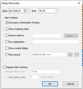
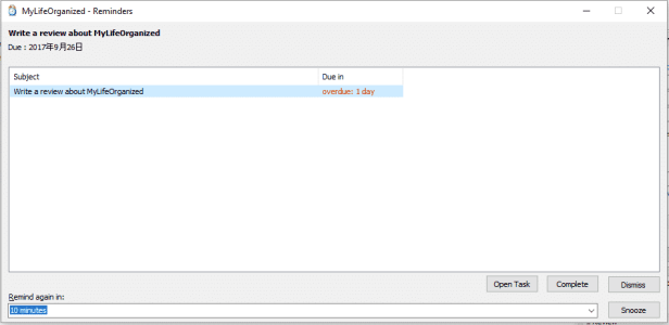
Reminder In MLO, reminders and due dates are separate concepts. While other apps often tend to make this equal, MLO takes a different approach. A reminder can be set to a single date or recurring dates, not necessarily related to the start or due dates. This allows for interesting setups: Setting a reminder 3 days before the actual deadline of an essay, sending a reminder half an hour before the office closes, and alike.
When a reminder hits, a notification will pop up. On Windows, it is an Outlook-like notification window, not integrated into the operating system. On the mobile platforms, it will show up in the standard OS notifications.
There are also settings for making sounds, sending an automated email, or running an application or script when the set time hits.
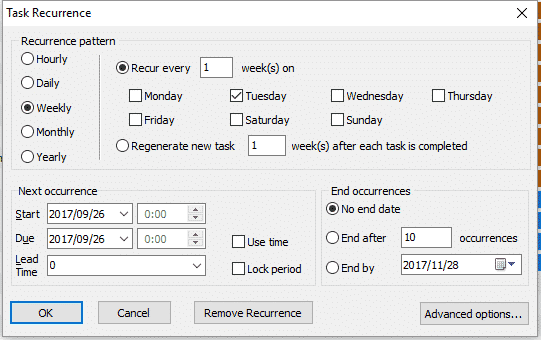
Recurrence Another pretty common feature in task management apps, but a little more complex in MLO – you should get used to this pattern, as almost everything in MLO is like other apps but ten times as customizable. The recurrence setting allows for advanced recurring task setups, which can recur by date, or subtask completion. It is also possible to set a number of occurrences or an end date of the last one.
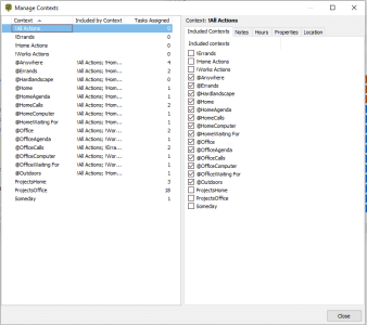
Contexts The contexts are a tagging system. Contexts are a main pillar of GTD and allow for filtering tasks like for related persons, related situations, related devices, or related locations. In MLO, a context allows easier searching and filtering, especially useful for creating advanced rules and custom views.
A context which corresponds to a location can be flagged with a GPS location. This allows for location-based notifications, especially interesting on mobile platforms. The mobile section below will discuss this feature in greater detail.
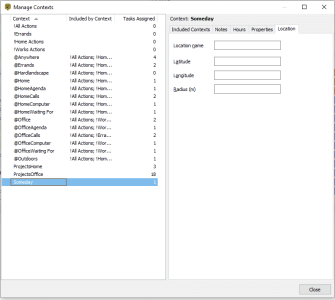
Dependencies This allows a relational model on top of tasks: A certain task is only workable on if another task or project is already finished. This allows fairly complex setups, spanning multiple projects or even areas of life. It has strong influence on the next action lists, as they make sure to show tasks in order of dependency.
Views
Views are a major concept throughout this application. A view is a certain view on the database. Previously mentioned, there can be a task outline with a hierarchy of all available tasks. There can also be flat lists of tasks, for example showing a next action list, a concept from GTD.
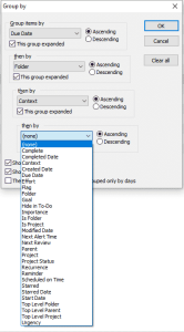
Multiple views are multiple different ways to display the same data. A view can filter for a certain folder or context. It can also show data sorted by due or start date, or simply rely on MLO’s algorithm to sort by urgency and importance. Recently modified tasks? A view. All completed tasks? Another view. Any way to query the data in the database can be set up as a view.
For any view, displayed meta-data can be shown or hidden separately. This allows for very simplistic views up to very complex ones. The number of columns can be selected for every view individually.
MLO has a big initial set of preset views but also allows for the further creation of your own custom views. Using this, any additional logic can be added.
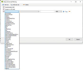
Advanced rules allow for a complex logic, including boolean expressions. This means a custom view can be set up to show something like (Due Data Before Today AND (Context Work OR Importance > 150)).


GTD centric functionality
GTD has its five main pillars. It starts with Capturing data. For this, the Rapid Entry dialog, as well as the Inbox, are of great benefit. For task organization and management, there are also great tools. Hierarchies, projects and drag and drop help organizing tasks as needed.
Another important part of GTD is reviewing. MLO got you covered. As meta-data, projects, folders or even single tasks can be set to be reviewed after a time span. If this time span is hit, it will show up in a view called Review. There, it can be reviewed and organized as needed. When marking it as reviewed, it will be removed from the Review pane until the time span is due again.
Another interesting feature which might be of interest for organizing long-term projects is called Goals. A task, project or folder can be assigned a Weekly, Monthly or Yearly goal. It will then show up in the Goals view, which shows an overview of all such goals. This allows easy tracking of long-term goals.


Last, next action lists, as described before, allow a smooth setup of GTD-related workflows. It shows next tasks based on attached dates like start and due date; and even will sort them with urgency and importance in mind. Other small nifty features like sequential projects and dependencies make this even better. The main theme of customization really leaves nothing open: MLO can adapt to anything imaginable.
Theme customization
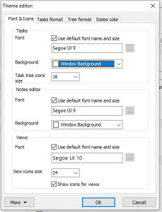
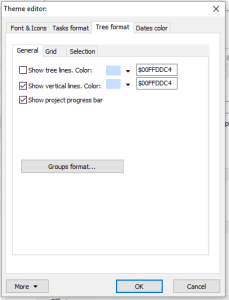
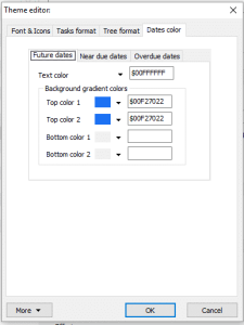
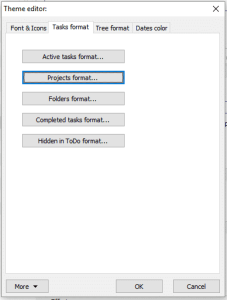
For a more custom look, MLO has two systems in place. There is an advanced theming engine which allows a customization of any detail in the app. This is rather static and applies to the full feel and look: Background colors, fonts, font colors, and font sizes.
MLO, especially on the Desktop, does not win design awards. It is a productivity suite focusing on functionality and customization. The theming can help, but has its limitations. Furthermore, the setup of themes can be rather time-consuming, as everything is spread over a dozen of submenus. It is powerful, but slightly ugly and pretty overwhelming from the beginning.
Theme files can be exported and shared. When searching the official forums, a few select downloadable themes created by the community can be found.
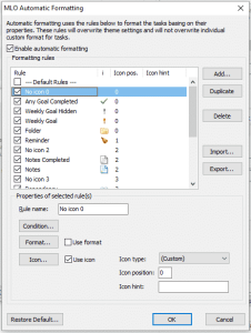
The second system for a custom look and feel is called automatic formatting. The previous settings were static themes: The overall background color of tables, for example. Automatic formatting rules allow for smart theming.
For example, one can theme data based on certain rules: Any due date should become a very big font. Or, a shadowed background for all projects which are currently flagged as paused.
Just to show the extent of capabilities for these automatic formatting rules, the second screenshot shows an absurd example. For any Overdue task, the background is striped in black and red, and the task title is a yellow bold Comic Sans with slightly increased font size. It also adds an exclamation mark symbol in front of the task title (if someone did not see the task, yet.)
While this example is, of course, non-sense, it shows its possibilities. Rules like these can be very helpful. After setting this up fine-granularly, this allows for seeing relevant tasks at a glance; based on meta-data like certain contexts, attached dates, parent folders, or a combination of all of them.
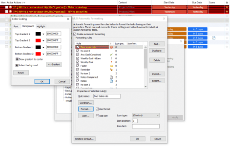
This functionality is exclusive to the Desktop app. While almost all previously mentioned features are available for both Desktop and the mobile platforms, the theming engine has not yet been ported.
Hundreds of more settings
The previous section covered quite a few settings and opportunities for customization. MLO goes further with a near endless settings menu. There is no point in talking about everything in detail. Especially, as nobody would ever need or use everything at once. However, it provides options.
While there are way too many options for a single user, there might never be anything not available in the MLO settings. Unwanted settings can just be kept on the default settings, which are already set pretty reasonable. Here, a slideshow of the available settings.
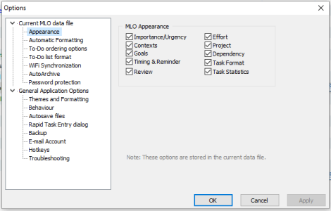
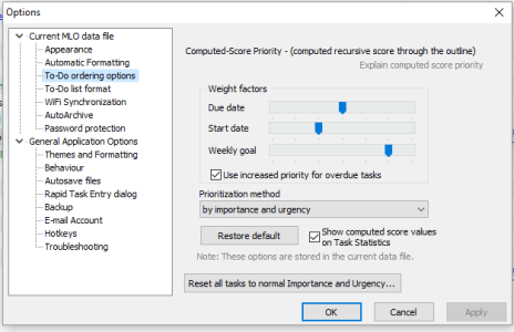
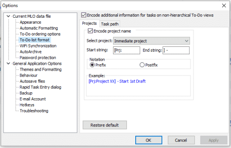
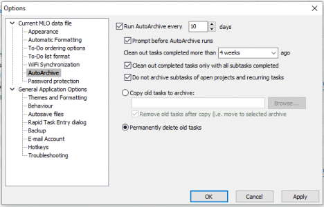
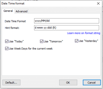
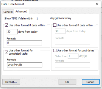
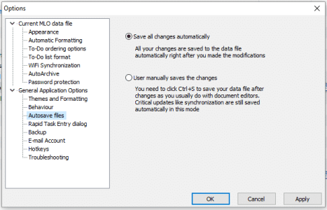
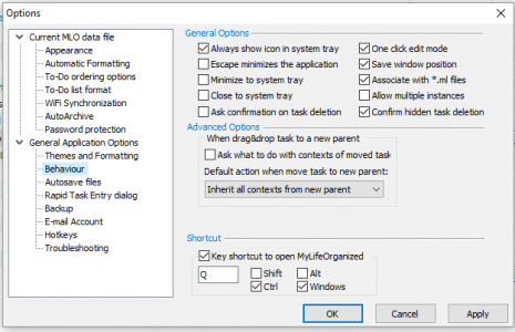
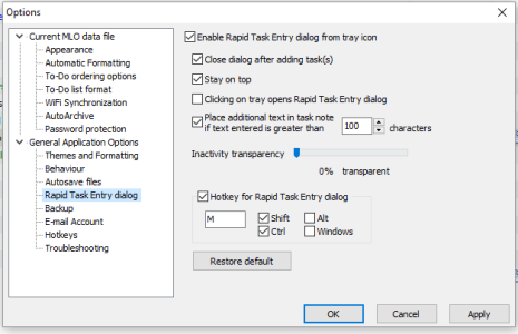
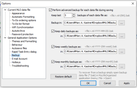
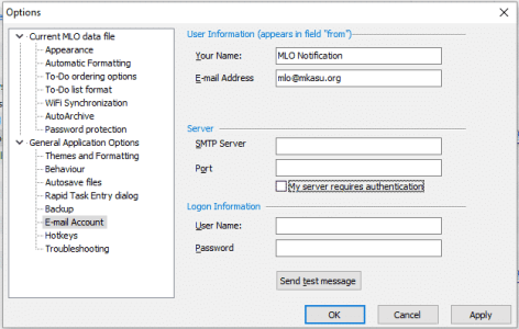
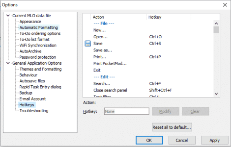
Just to point out a few. The auto-archiving and backup settings are probably the one of most interest. The former can automatically move old tasks to a second database file. It might be necessary after heavy use if the database gets bloated after thousands of finished tasks. The latter feature allows for automated backups. It will create daily, weekly and monthly backup files in a secure location. So, application crashes or an accidental delete will not cause a bad weekend.
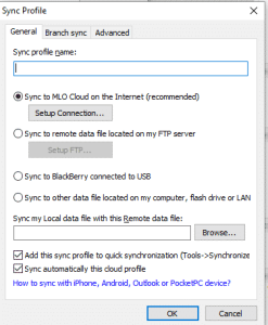
This covered, like, half of the settings. In the beginning of the review, various methods for syncing were presented: Cloud sync, Wi-Fi sync, Outlook sync, and more. MLO would not be MLO, if it would not cover a vast amount of settings for these, too.
Mobile companions
The mobile versions are similar to the Windows version. While the Windows version is a beast in functionality, a majority of it is replicated inside this mobile companion app.
On mobile, the custom views are equally complex as they are on the Desktop. The theming, on the other hand, does not allow much customization. Both the appearance and formatting is rather static. The capabilities for task management on each platform is equal. All meta-data fields from the Desktop app are available to both edit and view on the mobile platforms too.
There are some features, which are exclusive to the mobile platforms:
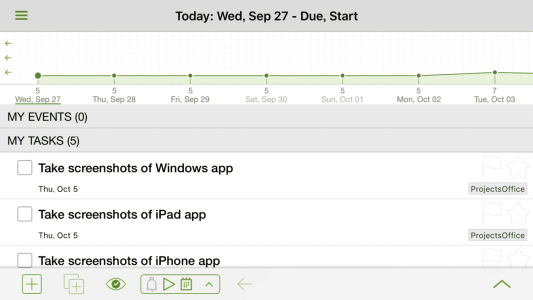
Calendar view This view shows you a forecast of the next days, highlighting the number of tasks due on every day. It integrates with other calendars set up on the mobile device.
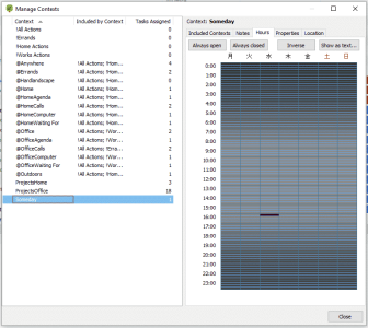
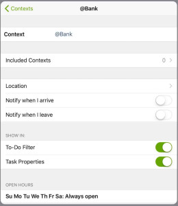
Location-based notifications A context can be assigned to a location. All tasks assigned to that context will receive notifications if entering or leaving the set location. Location-based notifications can also be coupled with opening hours. Then, location reminders will only pop up during certain time slots of the day.
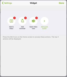
Widget The app allows to add rudimentary widgets to each operating systems dashboard or home screens. They unfortunately only allow shortcuts and do not show data.
iOS
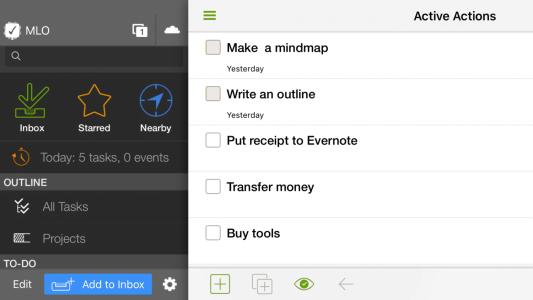
The iOS version of MLO is available for iPhone and iPad – a universal app in fact. The iPhone version includes a Watch app. The iPad version is pretty well adjusted to the larger screen size. Apart from that, both versions are equal in their functionality.
The iPad version is very well adapted to even big screens, even up to the 12.9-inch display of the iPad Pro. By incorporating a three-column layout, everything is viewable on the same screen without swiping. This makes it easier to work with than its competitor OmniFocus, whose UI is a little tedious on the iPad.
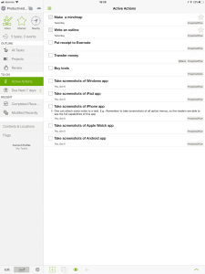
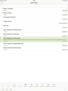
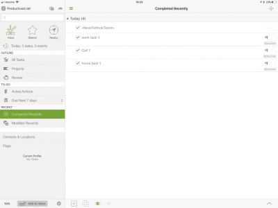
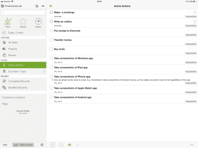
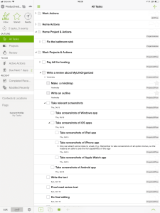
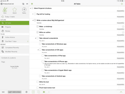
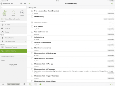
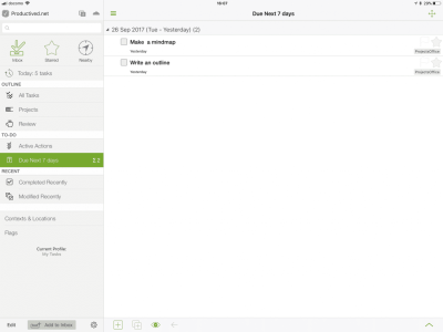
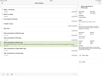
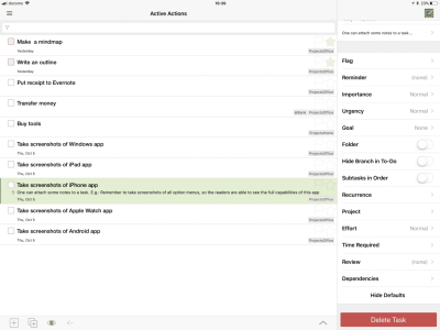
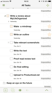
On the iPhone, the screen is adjusted to fit the smaller size, which folds the three-column layout into a swiping interface.
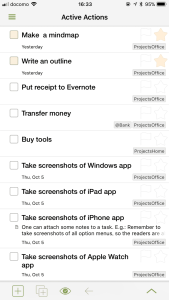
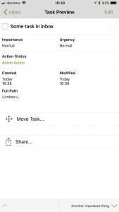
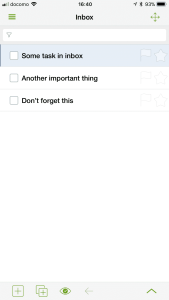
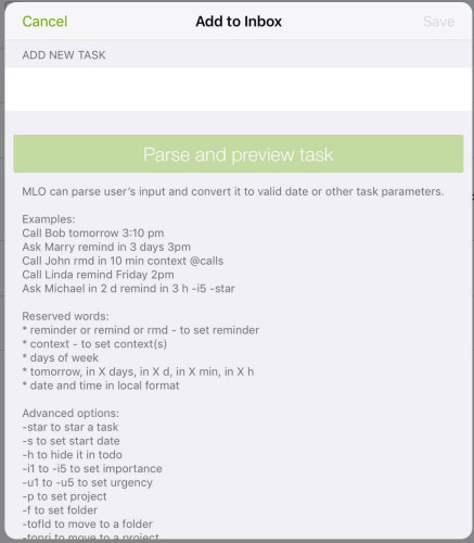
A great feature for quick entry on the go, especially on the iPhone, is the rapid entry menu. Similarly to the Windows app, it allows a quick entry of a task to the Inbox. It supports the same advanced syntax for smart input and even shows a handy list of useful syntax options on its welcoming screen.
The app integrates into the operating system for notifications, as expected. Similar to the notifications on the Desktop, this does not notify for Due dates but relates on the separate Reminder options available in each tasks editing menu.

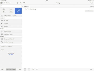
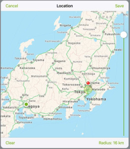
The aforementioned location-based notifications can be set up for each context individually. A map visualizes the radius of notifications, which are an adjustable distance away from a set GPS location.
During the tests, location-based notifications have been very reliable, even for smaller radii.
The calendar view summarizes a forecast of the next day, together with an overview of relevant calendar entries.
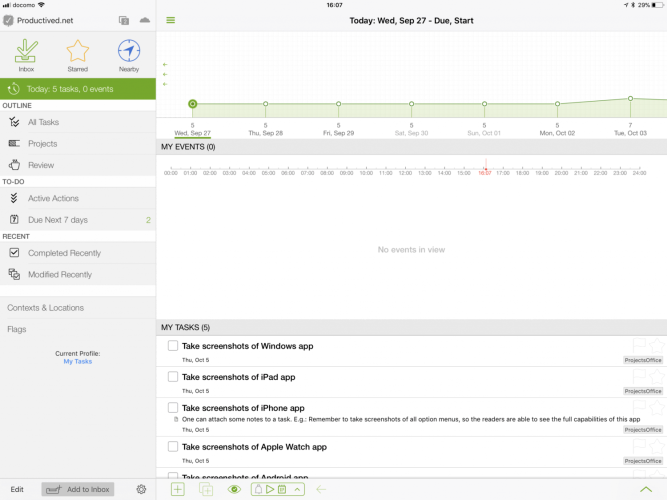
The custom view settings are as advanced and complex as available on the Desktop client. They allow sorting, filtering and any advanced multi-rule setup as previously shown on the Desktop review.
Unfortunately, the custom views do not sync via Cloud sync. They need to be set up on every device separately. One can import and export views by hand, which is cross-platform compatible. Thus, it would be possible to import the most precious creations by hand. This is a rather tedious process, however, so we hope there might be sync support for that in future.
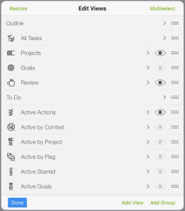
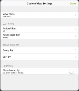
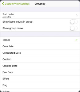
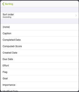
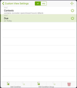
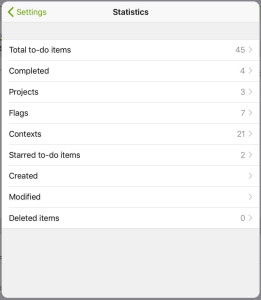
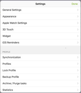
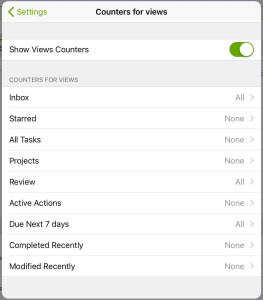
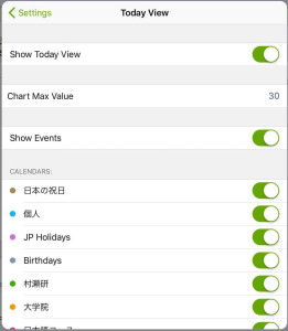
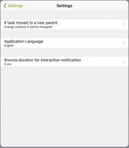
The settings menu is less advanced than on the Desktop, but should still be more than sufficient for this mobile companion app.
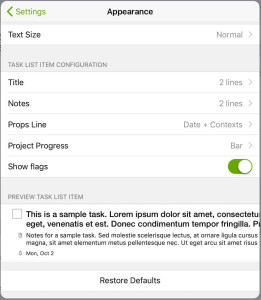
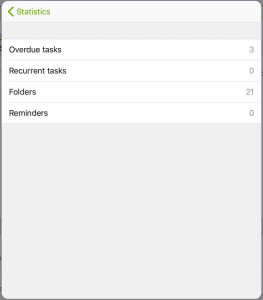
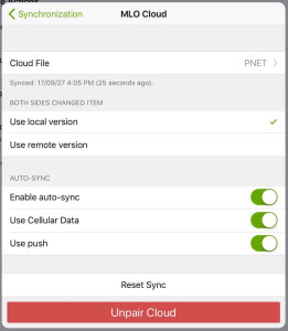
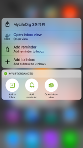
The dashboard widget for iOS looks like this. It can be customized with custom shortcuts to views or URLs.

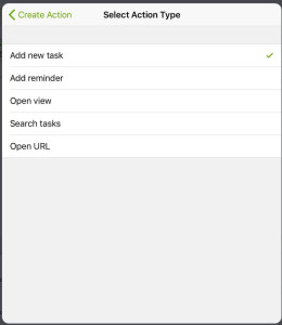
Last, some things which are unfortunately missing from MLO for iOS: It does not support a share extension. Therefore, it is not possible to integrate with data from other apps. Similar, it also does not allow integration into apps like Workflow, as it does not support internal linking between apps, or any API for that matter. For external data input, the Cloud sync subscription service with the email inbox is the only option.
While there has been an update following iOS 11, MLO currently (3.2) does not support the new Drag and Drop functionality for iPads.
Apple Watch
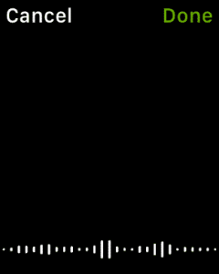
The Apple Watch app can show any custom view or Inbox. For each view, it will show available tasks and highlight due and overdue dates. For quick entry, it allows dictation, but no scribble.
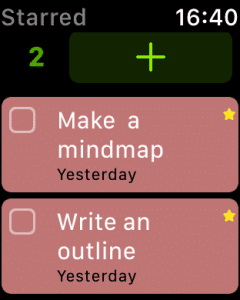
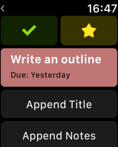
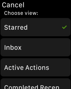
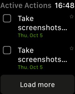
The complications allow MLO to show up on a watch face, showing the 3 next available tasks. The custom view is customizable but defaults to the standard next available tasks list, which sorts by assigned Due date, urgency, and importance.
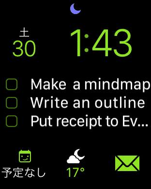
All notifications, including location-based ones, are timely and on the spot. The complications also to work without issues. The app itself has been less reliable in this test. On a Season 2 watch, there has been regular lagging and freezing, which made it a subpar experience.
Android version
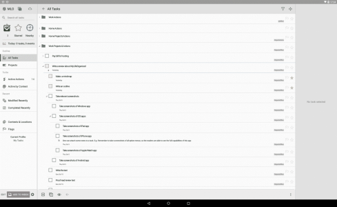
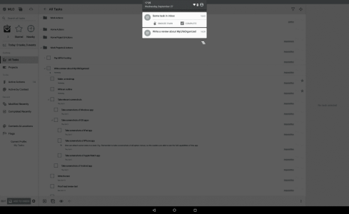
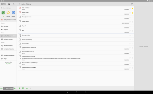
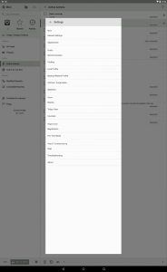
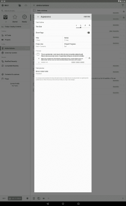
To evaluate feature parity, design, and overall compatibility, the Android version has been tested using an Android emulator. Overall, the functionality is on par with the iOS version.
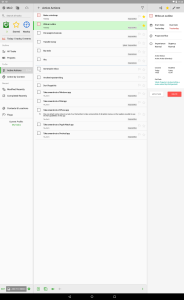
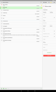
Due to the overall fairly custom look, which neither closely resembles iOS nor Android theming guidelines, it looks and feels almost identical. The Android version can switch between a tablet and phone mode. The tablet mode is identical to the iPad version. The phone mode looks similar to the iOS version, but relies more heavily on swiping to switch between the rough 3 column UI (e.g. View overview, currently selected view, and currently selected task.)
Strengths
A dream for productivity enthusiasts
With its sheer endless options, MLO is a dream for any productivity enthusiast. If you love playing around with options and settings, tweaking setups to their limits, there is almost no reason to look further.
Complexity as a strength
This goes back to the first subsection, which was called “What kind of app is MyLifeOrganized?”
MLO is extremely complex. Both the main Windows app as well as all mobile companion apps have an extreme depth. It might be even foolish to call the mobile apps a companion. Most functionality is available anywhere. The menus are deep, the options for customizability are almost endless.
It is fair to say, that probably nobody will ever need every single feature MLO provides. However, it is possible to cherry-pick. Not every feature needs to be used. The customization of views can be as depth, or as shallow, as wanted. After being done adjusting the app exactly as wanted, it will work that way.
The complexity ensures that nothing is missed and after using MLO for a long timespan, going back to any other app will certainly feel like a downgrade.
MLO works more like a framework and due to its complexity, virtually any imaginable workflow can be used with this suite of apps. Pick the things needed, customize them as wanted, and use your own approach to task managing.
The hierarchy of MLO has an unlimited depth. Folders can have sub-folders. Tasks can have sub-tasks, projects can have sub-projects. This is a great opportunity for even the most complex setups. With some extra stuff like dependencies, there can be full relational models based on ones own project data.
For people dedicated to productivity tools, this is a pure playground of options and settings.
Many options for sync
The various options for sync are very refreshing. Next to the subscription-based Cloud sync, there is Wi-Fi sync, FTP sync, and Outlook sync. Especially the last is something very rare, so if forced to use Microsoft Outlook at work, MLO might be a great companion.
Drawbacks
Steep learning curve
As MLO comes with no paradigm and is as flexible as you want it to be, it does no hand-holding. It does not force for a certain workflow, everything can be customized and adjusted, MLO will never tell you what to do. This can be a great disadvantage for many.
The learning curve is very steep and has few guidances. It is an app which needs your attention during setup. If playing around with settings and setups is not your thing, MLO is probably not your app.
Complexity as a drawback
Again, complexity. While we pointed out the complexity as a strength, it is really a strength and a drawback at the same time.
The danger comes with its options. Especially as a productivity geek, one might tend to overthink processes. There are hundreds of options in MLO. Sure, one might want to try every option, just to make sure to not miss out on things, right? This app can be a serious time sink. For most people reading this website, it will most probably be a time sink. Be aware of that.
Then, when mentioning the freedom of unlimited layers of abstraction for tasks, like sub-folders and sub-projects: This can also get confusing very quickly. Having the option to nest sub-task into a sub-task into a sub-task, well, you get the point. MLO has no set paradigm for this. Anything in the outline can be nested unlimited.
When often being late on reviews or drifting into an unstructured organization, the database can get very messy, very fast. Then, there is no productivity at all, and the suite will do the opposite of what it is supposed to do. A database built up over years, with scattered tasks everywhere. This needs manual maintenance.
The freedom of MLO is gorgeous. And dangerous. Too convoluted task lists can be overwhelming, even intimidating. MLO does not force a paradigm or workflow, but this can be both an advantage or disadvantage.
Missing system integrations on mobile
For the capturing process, MyLifeOrganized is missing a couple of helpful features. The mobile app of MLO unfortunately does not have many system integrations. Thus, we miss both a Share Extension and support for Callback links (iOS). The latter would be needed to set up workflows with Workflow app.
Conclusion
MyLifeOrganized is a pretty big beast. It might be the most complex task managing suite by far. It even triumphs OmniFocus and any other tool with extremely advanced custom views, and other features like theming and auto-formatting.
MLO is an alternative to OmniFocus on Windows and Android. As they still provide a good iOS app, it can be a good solution for people who use Mac in private, but Windows at work.
But, does the customizability and freedom make MLO a good app? It depends. It is a dream for people who want the app to adapt exactly to their own thoughts and processes. In this sense, it is more of a framework than anything already done. The features, however, can also be intimidating, as the app comes with its steep learning curve.
The customizability allows MLO to adjust to virtually any workflow, but does no hand-holding. It also does not come with its own paradigms, so it won’t stop the user if doing something wrong or unproductive. The unlimited layers of hierarchy allow for both freedom and self-induced over-complexity.
If you are interested in a flexible app which can adjust to your needs, don’t look further. MLO puts the burden of setup to the user, but then allows endless possibilities. If you’re rather interested in relying on a sophisticated preset workflow, which defines how you should use the app without a large learning curve or setup phase, something like Todoist, Things 3, or GTDNext might be a better fit.
How to you feel about the customizability of MLO? Is it a dream for your needs, or do you rather prefer a preset solution? Discuss this tool in the comments and share this post, if you liked it!
Pro
- Closest contender for a Windows compatible alternative to OmniFocus.
- Extremely customizable
- Unlimited layers of abstraction for projects and tasks.
- Various ways for sync, including Outlook for enterprise use.
- Cloud sync allows fast and good syncing with extra features like an Email Inbox for new tasks.
Contra
- Overall, rather ugly. Functionality definitely comes over design.
- Expensive, if bought for all platforms. Cloud sync costs extra.
- Customizability can and will result in a serious time sink.
- Unlimited layers of abstraction can get overwhelming very quickly.
- Cloud sync does not support end-to-end encryption.
Summary of MyLifeOrganized
Highly complex suite for all task management needs. Can adapt to any workflow.
Expensive. Freedom of customizability can be intimidating.
Windows $29 (Standard) to $59 (Pro), Mobile Free (Standard) to $25-30 (Pro), optional subscription for Cloud sync
Tested platforms: Windows iOS Android
This review tested the following versions: Windows: 4.4.8, iOS: 3.2.9, Android: 2.11.3.

Screenshots


Disclosure: This post may contain affiliate links. This means I may make a small commission if you make a purchase.
About me
Dr. Marc A. Kastner
I am an assistant professor working on computer vision and multimodal understanding. I am interested in task- and knowledge management. In my free time, I blog on productivity workflows and apps.
For my professional portfolio, please visit: marc-kastner.com
See Also
GTDNext
This review takes a closer look at a task management service called GTDNext. The very acronymic name already tells half of the story: If …
Read More...OmniFocus 2
With its initial release in early 2008, OmniFocus grew to be one of the most prominent task management suites on the Apple ecosystem. It is …
Read More...OmniFocus 3
OmniFocus entered its third release cycle with the release of OmniFocus 3 for iOS. The app became one of the most prominent task management …
Read More...